Give a designer a rule, and they’ll show you the exception with surprising, stylish and colourful results.
We spoke to five designers about the design rules they most like to break – ones that will encourage you to create your own unique home without limitations.
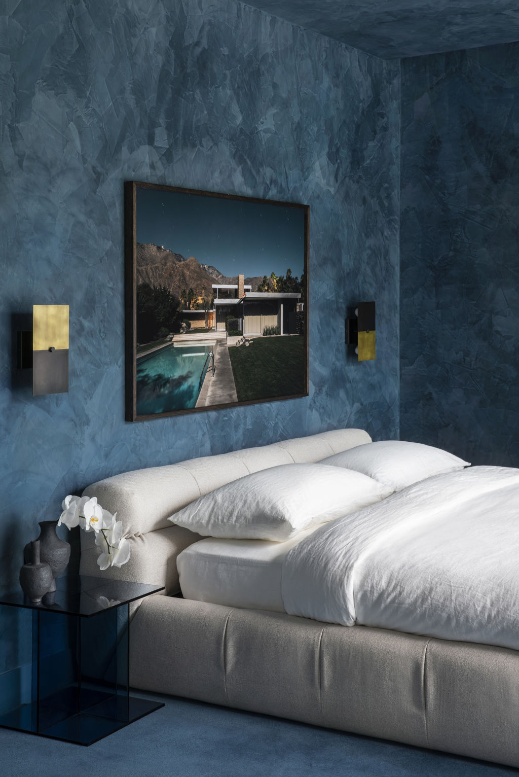
Rule 1: White, light bedrooms create the most peaceful retreat
Designer Chelsea Hing ditched the white and instead went with a denim-blue tone for this bedroom. Photo: Rhiannon Taylor
While spaces filled with natural light create a feeling of restfulness, calm and joy, designer Chelsea Hing employed denim blue for this bedroom in order to dial down the light and create a sense of quiet.
“Natural light is the holy grail, but in this case, it was about controlling the light so it is dappled and natural,” she says. “I find blue restful to sleep in, and for this bachelor pad, it was a great outcome – masculine and cool, but still serene.”
For Hing, a sleepy bedroom is one that embraces colour saturation and tones for a subtle “murkiness”. Polished plaster is used for depth and detail and executed in a singular colour, creating a cocooning sensation.
“The depth of colour feels mysterious and has a calming effect, and light sheers and a cream bed are a counterpoint to the blue, allowing it to shine,” she says.
While symmetry in design is the ideal, it cannot always be achieved in a practical sense. Design by Lara Ette. Photo: Amanda Prior
Rule 2: Always use symmetry in design
While there is an emphasis on symmetry and order in classic architectural details, designer Lara Ette says it isn’t the only way to create beautifully cohesive designs.
“Had I not, the bench space on either side of the basin would have been too small to be useful,” she says. “It was more practical to create bench space on one side, and I provided balance to the design with a pendant light. Its shape and size work together to fill the space.”
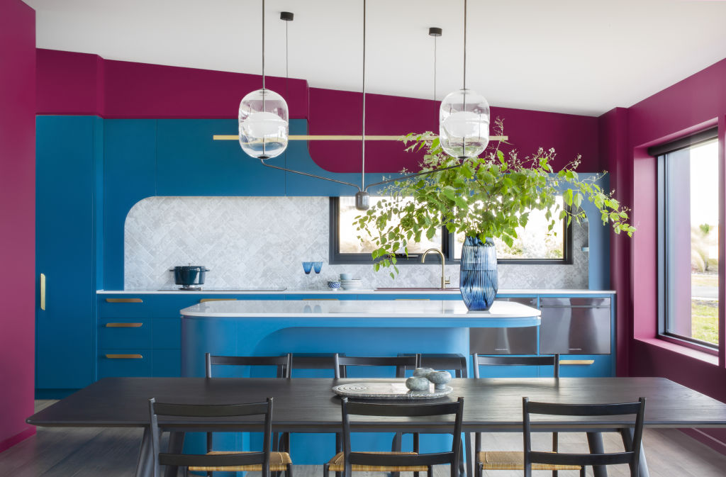
Designer Kate Challis went all out with colour in this kitchen design. Photo: Robyn Lea
“White requires real finesse, styling and layering to look great,” she says. “Very few people know how to make white work. Usually, it just ends up looking bland and devoid of personality.”
Combine your favourite vibrant hues or pluck a colour from an element in the space, such as patterned upholstery, artwork or floor rug.
“I was recently in Mexico where the houses are painted in bold colours as they believe that colour breathes life into their town,” she says. “Be inspired by wallpaper, patterned tiles, colourful natural stone and bold colours, and do what makes you happy.”
Blue and green should never be seen? Not so for designer Nickolas Gurtler. Photo: Timothy Kaye
Rule 4: Blue and green should never be seen
“I think this is just a silly saying!” says designer Nickolas Gurtler. “Colour should be combined and experimented with, and blue and green naturally pair beautifully and can be calming or energising depending on their application.”
Look for soothing blue-green hues like teal, turquoise and aquamarine, take inspiration from nature and add a neutral tone for flair.
“Stainless steel, glass and walnut timber mixed with blues and greens makes for a sophisticated space,” Gurtler says. “Just don’t confuse the undertones – being a secondary colour, greens, in particular, have a wide variety of undertones, so combining brown or yellow-toned greens with blues can be tricky.”
Designer Shona McElroy of SMAC Studio created a moody lounge area by painting the ceiling in a dark hue. Photo: Dave Wheeler
Rule 5: Ceilings should always be white
White ceilings are popular for creating the illusion of depth, for light, and for ease of maintenance.
“Painting your ceiling white depends on the mood you want to create, but I’m a big fan of making small spaces moody, and painting the ceiling a colour keeps it cosy,” says SMAC Studio designer Shona McElroy.
Considered the fifth wall of a space, a ceiling’s colour is more critical to the room’s overall feel than you might think. Try colour-blocking with a light and dark version of the same hue, or for an all-enveloping feel, match coloured walls with the ceiling. Or, take a leaf from McElroy’s style book and paint it black, which can feel dramatic and make the space feel larger.
Right angles are out as more organic forms make a big comeback in home design – though history shows that curves never really go out of style. From rounded edges to archways, curves are back in style. Image: realestate.com.au Across the country, new homes are showing off the latest design trends and … Read more
Three distinct interest rate cutting cycles since 2015 show how Australia’s housing affordability crisis has fundamentally changed which suburbs benefit most from lower rates. Australia has experienced three major interest rate cutting cycles since 2015, each delivering vastly different impacts across the housing market. The Reserve Bank’s gradual easing from … Read more